Showing posts with label crime. Show all posts

Saturday, December 7, 2013

Painting Rocky Jordan: Process

Continued from yesterday's post on the pencil process, here we are in the paint. Part 2:

I transferred my drawing to a heavy weight illustration board prepared with gesso using a graphite pencil and sharpened up the drawing using Prismacolor pencils: Burnt Ochre, Light Umber, Terra Cotta, and Black.


I also tinted the overall board with a light coat of Raw Umber acrylic paint and blocked in the dark's with Payne's Grey or Raw Umber.

I cut some masks using a clear acetate and started on the background colors, keeping the two main figures covered up. I glazed acrylic color with the airbrush into the overall background, working light to dark, and enjoying the process of the colors working together; warm and cool. At this point I was creating a dance between the blue sky at dusk (Cobalt Blue) and the warm glow and shadows of the buildings (Yellow Ochre, Raw Sienna, Raw Umber, Burnt Umber, Ultramarine Blue, Phthalo Green, and Dioxazine Purple).


Examining the hue of the sky against the buildings:

After I've laid down the background colors, I remove the masks to take a look at what's going on. Total time is approximately 5 hours. Background is not complete but it's time to move onto the figures before I work on the background anymore. I'll complete the background and figures pretty much together as the painting starts to fall into place.

I start with the flesh tone of both figures (Raw Sienna, Burnt Sienna, Light Portrait Pink) and shadows in the face and hands (Viridian Hue Perm., Cerulean Blue).


A short break and call to my friend Anthony Schiavino. He and I collaborated on my Knuckles, Tough Guy for Hire painting for his publication, "Episodes From The Zero Hour". Anthony knows pulp and I've trusted him for many years. I'd been tossing around ideas for both Rocky's coat and the femme fatale's dress but I wanted Anthony's opinion. Even though I knew which way I was leaning - I wanted to be absolutely sure. White coat and deep blue dress. Got it, thanks Anthony.

I bit of Dioxazine Purple and Raw Umber next to some Cadmium Yellow Medium areas, then Ultramarine Blue glazed over the dress.

Stay tuned.

Friday, December 6, 2013

Sketching Rocky Jordan

I had another wonderful pulp opportunity of illustrating the cover collection for the old time radio show “Rocky Jordan” available from Radio Archives this year. A  quick introduction for anyone who isn’t familiar with the show can be found on RA’s website; "Rocky Jordan" is very reminiscent of the classic movie "Casablanca." You'll remember that, at the end of the 1942 movie, nightclub owner Rick Blaine (Humphrey Bogart) and Police Captain Louis Renault (Claude Rains) walk off into the night, leaving Casablanca to join the Free French garrison across the desert. The settings of both stories are nearly identical: the desert sands, the fez, the turbans, the robes, the underworld lowlifes who visit the cafe. In "Casablanca," 'everyone comes to Rick's'. Not so in "Rocky Jordan;" the Cafe Tambourine is a lower-class establishment (in Cairo). It's more a waterfront dive, filled with forgotten men. And, unlike "Casablanca," the war is over -- but not the mystery or the intrigue. I really like the characters and stories - and enjoy working while listening to the shows.
The project presented some interesting ideas, but I felt I had a rough start pin pointing something special for the client. So I started diving into my sketchbook.
I originally was creating thumbnail sketches that were inspired by paperback covers by David Grove and/or Kazu Sano. I was interested in more of a montage of characters and setting with mood lighting and colors. I thought it would fit the right emotion that I got out of listening to the programs.

But, after looking at the quick thumbnails, I realized it just wasn’t going to work for the OTR audience and packaging. At least I crossed off one option and time to keep moving forward. So, I decided on a doing a scene reminiscent of noir film, or vintage pulp imagery with a femme fatale confronting Rocky. In the background I’d want the policeman Sam Sabaaya to be seen coming out of, perhaps, the Cafe Tambourine, just in time to help the situation and solve the case. That’s what I was thinking here and it was enough to get me going.

I sketched out a tense scene in the Cafe Tambourine and liked what was going on with the action and composition. Good story illustration but I felt it wasn't working yet. It would be a nice sequential panel but with Rocky's back to us wasn't good for a cover. The best solution was to turn him around and get the viewer involved, and I did a quick rough sketch to see what I thought. 

The more I left this idea alone, the more it kept growing on me. I decided to move forward with this for the moment and see what I can do with it. Once I shot my model for Rocky Jordan and collected my other references, I pulled together a tight drawing - and I ended up really being pleased with the results. I pulled back on the composition to see more of the figures, especially Rocky in front. Tom Brown at Radio Archives agreed and approved the drawing right away and I was thrilled to begin painting this one.


Monday, June 10, 2013

Sketchbook 3

Long over due for a post here, so I'm getting right to it. My new Sketchbook is available at all upcoming conventions and signings. Sketchbook 3 is heavy on the pulp this time around and is printed on glossy paper. It nicely displays the black and white painted spots that I created for a variety of pulp oriented projects. Collected are pencil sketches for covers for Radio Archives, American Fantasy Press, and others but most of the art is finished illustrations. Plus I've featured some of my favorite characters including: detectives, femme fatales, John Carter, Tarzan, Green Hornet, The Shadow, and others!
Upcoming is Wizard World Chicago, August 8-11 and a late July signing (to be announced) at Reel Art in Berwyn, Illinois.

Thursday, June 30, 2011

Yours Truly Johnny Dollar

The first in a series of cover illustrations for Radio Archives is the classic detective, Johnny Dollar. The old time radio program, "Yours Truly Johnny Dollar" was no mystery to me! I've been a fan of the series for a number of years and it's one of my favorites. Along with music, I listen to a lot of OTR in my studio while working. So, it's very exciting for me to be involved with creating artwork for the Radio Archives collections. I really needed this cover to appeal to die hard fans of the show as well as for a possible new audience. After selecting a thumbnail concept, I developed a tight sketch for approval and then painted the finished art.


The collection is available in stores or directly from the Radio Archives website: www.radioarchives.com

Wednesday, December 31, 2008

Sketchbook Entry 11: Happy Noir Year

This next drawing from my Sketchbook is from the cover of "Episodes From The Zero Hour" Volume 1 from Blinding Force Productions featuring Tommy "Knuckles" McNichols. This piece (and specifically the finished painting) is a very important project to me: one, because I'm mighty happy with the way all the noir, pulp and private eye influences all fit together for me, two: because the project moved along nicely with the writer, art director and designer and, three: because it forged a great professional and personal friendship with the designer Anthony Schiavino. Aside from Anthony having an impeccable eye for good design, he's a great writer / creator himself with some really fine ideas. Anthony and I talk a lot via email all week long, talking about everything important: comics, films, art, work and family (not in that order). We've become great friends this year and it all began with a Tough Guy, named "Knuckles" created by his cohort Jay Butkowski. It's a great pulp story (available at: www.lulu.com/zerohour) so give it a try.


When Anthony first inquired about my schedule and interest in the project, he had the cover designed with color palette options and a rough sketch. The original layout had "Knuckles" sitting behind the desk with his feet up, but after discussing the character with Jay and Anthony I came up with a rough thumbnail that had more body gesture and attitude of a tough guy for hire. More of a "Bobby the Mitch" swag to his personality. I also put more emphasis of noir by adding the blinds and played with light and shadows. Adding the framed boxing photograph behind him in the shadows introduced a bit more of the characters past.


Have a great 2009! Thanks for visiting the blog over the year. It's been quite a busy year for me, which explains the lack of posts but I'll get to them and I will try and update with new posts on a more regular basis in the coming year. I still have some exciting things to showcase as they take shape as well as continuing with the Sketchbook entries. See you next year.

Thursday, September 4, 2008

Sketchbook: Entry 9 (Hey Toughguy!)


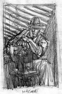
This is a thumbnail for the first Jack Hagee: PI cover for Moonstone Books a few years ago. I still have this thumbnail in my files but the original finished drawing that came after this thumbnail is in the collection of Hagee's creator and author, C. J. Henderson. I seemed to have misplaced a scan of the finished pencil drawing that came after. (But, I will continue to search).
I took some of my favorite elements of film noir and worked with the shapes, shadows and attitude. I sat in my studio, dimmed the lights and fell into Hagee's noir world. As I began sketching I swore I heard his chair squeak as it turned toward me and say, "So... how 'bout it?"

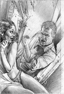
For a second Jack Hagee cover we went for a bit more action with a pulp inspired cover. But, he's not helping a damsel in distress here. Behind the locked door is the wife or the girlfriend, caught in a game of lies. And Jack hates this part of his job...