Showing posts with label Sci-Fi. Show all posts

Monday, June 10, 2013

Sketchbook 3

Long over due for a post here, so I'm getting right to it. My new Sketchbook is available at all upcoming conventions and signings. Sketchbook 3 is heavy on the pulp this time around and is printed on glossy paper. It nicely displays the black and white painted spots that I created for a variety of pulp oriented projects. Collected are pencil sketches for covers for Radio Archives, American Fantasy Press, and others but most of the art is finished illustrations. Plus I've featured some of my favorite characters including: detectives, femme fatales, John Carter, Tarzan, Green Hornet, The Shadow, and others!
Upcoming is Wizard World Chicago, August 8-11 and a late July signing (to be announced) at Reel Art in Berwyn, Illinois.

Sunday, February 26, 2012

The Howard Wolowitz Wall of Fame


Hey! Can you spot my Stella 7 painting gracing the wall in Wolowitz's bedroom? As a fan of the hit television Big Bang Theory, my family and I were thrilled to learn that there was a poster of her nicely displayed among Howard's Space Girl bedroom decor. There's a lot of really great artwork hanging on all of the sets. So, I am incredibly flattered that someone thought to include a poster that was promoting the comic book Space Doubles from Third World Studios a few years back. The painting was originally commissioned for the Chicago Fantastic Film Festival commemorative poster, featured in a Spectrum art annual and then as the cover for my first Sketchbook. But as my friend Steve Boyd commented: "You know you've made it big when your artwork makes the hallowed Walls of Howard Wolowitz." Thanks to Eric LeFaber for telling me about it before I saw it for myself.

Wednesday, June 22, 2011

Star Struck: Process


For my painting STAR STRUCK, I grabbed a rough thumbnail that was sitting in my sketchbook and quickly developed a concept and design influenced by the black and white illustrations from artist Virgil Finlay. I admire Finlay’s imagination, design and craftsmanship, especially with the female form.

My space heroine is so awe struck (or star struck) by the alien world around her that she has innocently fallen into danger - and without a ray gun at her side! While working on the composition and my drawing, I started to think about dramatic and effective color. That’s when a palette reminiscent of pulp covers by Hubert Rogers seemed like a good choice to me. Rogers has a wonderful sensibility of his subject matter with an attachment to art deco. My color choice made the image more romantic and dream like, which set a nice mood against the ensuing danger. Pulp covers are full of excitement with dramatic colors, pretty dames, cool costumes and ugly monsters. My alien world draws our victim close enough to be dragged into an unknown world or… to her doom.


SKETCH: After roughing out a design and composition on paper based on my thumbnail, I gathered my photo references and spent time focusing on my star struck girl, designing her art deco space suit and dramatic lighting from the stars that surround her. I then transfer the drawing and develop a tighter drawing directly on the illustration board.

In the past, I enjoyed the process of working out very finished pencil drawings where I was solving all obstacles, putting all my thoughts down on paper and spending an average of 3 -5 hours working on studies before even thinking about painting. Recently, I have decided to spend more time working and drawing directly on the board. I gain more time against a deadline and enjoying the immediacy of painting.


ON THE BOARD: Working on a gessoed illustration board, I developed a detailed drawing using color pencils; light umber, terra cotta, indigo blue and light violet. I start painting with Liquitex acrylics by blocking in darks (Payne’s Grey) with flat brushes and introduce some more color (Raw Umber and Burnt Sienna). Once I start usinig a #4 round for details I know I’m about to broadly apply glazes with the Iwata HP-C air brush. I quickly cut some acetate masks with an x-acto blade around the figure, the alien, the red planet above, and the planet below.


COLOR: I lay masks over the figure, the alien at her legs, the planet above and the planet below and paint the background of stars and outer space, which allows me to establish the overall darks and lights. I then move onto the alien world and tentacles. While applying the acrylics with the airbrush I play with watercolor texture effects using rags and sponges.


FINISH: Once I add the strong yellow dramatic light on the figure and paint her space suit with Payne’s Grey and Brilliant Purple, I set the mood for a warm red planet at the top by applying Indo Orange Red and then Naphthol Red Light with the air brush. I wrap everything up by painting her flesh tone on her face and tying details together with a little more color pencil work and opaque paint and brushes. I spent approximately three 10 hour days on this project. Another day and a half pulling the article together and selecting photos.


Cover art and color inspiration by Hubert Rogers

(The original concise article was featured in the January 2011 issue of ImagineFX magazine. This post adds more insight and more photos into the step-by-step process.)

Monday, January 24, 2011

Sci-Fi A-Z: Pulp

"Capture the essence of space pulp". That's the title given to the step by step feature written by me explaining the inspiration and process behind my new painting, "Starstruck". I owe a world of thanks to Ian Dean at ImagineFX magazine for contacting me back in October. I was able to pull a concept of mine out of my sketchbook and fine tune it to his needs and paint it for their upcoming Ultimate Guide To Sci-Fi Art issue. And now in the January 2011 issue sporting a TRON cover, there's a wonderful feature that is titled, "A-Z Of Sci-Fi Art". You'll find "Starstruck" under the letter "P" for Pulp on page 64. It's an incredible magazine filled with amazing images. As well as an interview with one of my favorite artists, Moebius. Run out and buy issue 65, available now. And check back later because I plan on posting the "director's cut" of my step by step process.

In issue 65:

Thursday, July 31, 2008

To Be Continued...

My obsession with comic strips, comic books, spaceships and science fiction started with watching the reruns of the Flash Gordon serials (starring Buster Crabbe) on television. I can still remember being captivated as I watched them early Saturday or Sunday mornings with my Father and brother. As a young artist, the serials made an incredible impression on me and my imagination took off.

I have a good friend who is a huge vintage sci-fi and rocketship collector. He has an amazing collection and awhile back we got on the topic of Flash Gordon collectibles. He remarked that, in his opinion, there wasn't an ultimate Flash Gordon painting out there that truly captured the verve of the beloved serial or Buster Crabbe. Everything was nostalgic and not contemporary. We talked about all the great moments of the serial, the visuals and how it would be a great personal project for me. He then talked me into doing this as a commission for him (as well as using it as a promotional piece).


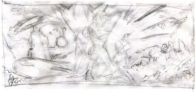
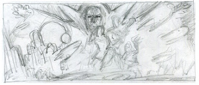
We started to discuss what it should look like and all the elements that it needed in the homage. I've saved you from viewing some of the awful scribbles that I did while we originally chatted about the scope of the piece. Instead I've selected some of the early thumbnails that came out of the discussions and then you'll see how I progressed and narrowed down the elements and design.


I thought that I had it with this one, so I started to focus on the details. Notes were written and I began looking for good reference.


Then I roughed this one out, one day while looking at the development. Something about it felt "right". Even though you probably can't tell by looking at this rough. The design and composition fell into place. So I started to focus on this one:


And from here I narrowed down my references and started to work on individual studies:


The Buster Crabbe study really didn't capture his likeness very well. But, from here I realized what my mistakes were when I began working on the painting.

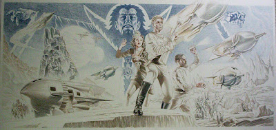
Everything developed directly on the board. I don't usually start a painting without doing tight pencil drawings and studies to get my homework done. This way I feel like I worked out my problems ahead of time and then I can concentrate on just painting. This one was an exception. Simply, because I was running behind on my self imposed deadline and I wanted to finish it for the upcoming Pulp Show and start showing friends what I'd been working on for the last three - four months (in between assignments).


I started to draw directly on the board, putting all the elements in place and any problems that arose I simply solved them as they occurred.
Once that I completed the drawing (which took about 5 days), I blocked in my darks with Acrylics and started the painting.


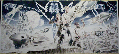
The painting took a good week of 10 to 12 hour days. Fortunately, I found a break in my schedule and was able to paint it within that weeks time with some fine tuning of minor details here and there the following week.


Please view the finished painting at my website: www.douglasklauba.com