Showing posts with label Pulps. Show all posts

Saturday, December 7, 2013

Rocky Jordan Is Finished!


Part 3: I'm set to wrap this project up. Now that I have the background and foreground colors in place, I start finishing the painting.

The dark's are placed first; Rocky's hair, her 1940's hairstyle, folds in their clothes, shadows, the green fern on the left, and work on the details in the buildings. I finish up with adding first the warm highlights and then finally the cool highlights first in the figures and followed by the background.

I step back and decided to darken up the figures in the foreground first and add more blue over the flesh tones. Then I decided to fine tune the background adding cool Greens, Blues, Purple, and Payne's Gray. Approximate time for the overall painting was 25 hours.

I immediately set to scan Rocky Jordan and make a few notes to myself on what I should touch up. I will do a few fine tuning and clean up in Photoshop before I save and send the file. Images of black and white spot illustrations start developing in my my mind. I'm still so immersed into the project, I'm thinking of what else I can do.... but it's onto the next one!

Friday, December 6, 2013

Sketching Rocky Jordan

I had another wonderful pulp opportunity of illustrating the cover collection for the old time radio show “Rocky Jordan” available from Radio Archives this year. A  quick introduction for anyone who isn’t familiar with the show can be found on RA’s website; "Rocky Jordan" is very reminiscent of the classic movie "Casablanca." You'll remember that, at the end of the 1942 movie, nightclub owner Rick Blaine (Humphrey Bogart) and Police Captain Louis Renault (Claude Rains) walk off into the night, leaving Casablanca to join the Free French garrison across the desert. The settings of both stories are nearly identical: the desert sands, the fez, the turbans, the robes, the underworld lowlifes who visit the cafe. In "Casablanca," 'everyone comes to Rick's'. Not so in "Rocky Jordan;" the Cafe Tambourine is a lower-class establishment (in Cairo). It's more a waterfront dive, filled with forgotten men. And, unlike "Casablanca," the war is over -- but not the mystery or the intrigue. I really like the characters and stories - and enjoy working while listening to the shows.
The project presented some interesting ideas, but I felt I had a rough start pin pointing something special for the client. So I started diving into my sketchbook.
I originally was creating thumbnail sketches that were inspired by paperback covers by David Grove and/or Kazu Sano. I was interested in more of a montage of characters and setting with mood lighting and colors. I thought it would fit the right emotion that I got out of listening to the programs.

But, after looking at the quick thumbnails, I realized it just wasn’t going to work for the OTR audience and packaging. At least I crossed off one option and time to keep moving forward. So, I decided on a doing a scene reminiscent of noir film, or vintage pulp imagery with a femme fatale confronting Rocky. In the background I’d want the policeman Sam Sabaaya to be seen coming out of, perhaps, the Cafe Tambourine, just in time to help the situation and solve the case. That’s what I was thinking here and it was enough to get me going.

I sketched out a tense scene in the Cafe Tambourine and liked what was going on with the action and composition. Good story illustration but I felt it wasn't working yet. It would be a nice sequential panel but with Rocky's back to us wasn't good for a cover. The best solution was to turn him around and get the viewer involved, and I did a quick rough sketch to see what I thought. 

The more I left this idea alone, the more it kept growing on me. I decided to move forward with this for the moment and see what I can do with it. Once I shot my model for Rocky Jordan and collected my other references, I pulled together a tight drawing - and I ended up really being pleased with the results. I pulled back on the composition to see more of the figures, especially Rocky in front. Tom Brown at Radio Archives agreed and approved the drawing right away and I was thrilled to begin painting this one.


Saturday, November 17, 2012

H.P. Lovecraft Visits Sam Spade

I was visiting a friends gallery awhile ago and was asked about some of the projects I was currently working on. After offering some top secret information about various assignments, I mentioned a very interesting commission that was sitting before me. I said, "There's this really interesting piece that I've been sketching and about to start painting. It's H.P. Lovecraft visiting Sam Spade (portrayed by Humphrey Bogart) and Lovecraft is presenting a cthulhu statue, while Sam is displaying his Maltese Falcon." The explosion of laughter and enthusiasm from my friends at the gallery was exciting and it actually took me off guard!
I had known that I was fortunate to receive this commission but I didn't think anyone else would understand it or find it as exciting for me or for the patron who approached me. After all it was a personal request that the collector had been thinking about for sometime - and was waiting patiently for me to paint. In fact, when he first explained his idea to me, I immediately thought how awesome of a concept it was, but he didn't think it would be something that I'd be interested in or that I'd find it as cool of an idea that he'd been keeping to himself!
So, we discussed his idea in depth and did some rough thumbnails to capture his idea all while the "Maltese Falcon" played in the background. I wanted the complete back story so I could do his concept a deserved service and something that he can feel pride in. All I will say is that my friend, John is a big time detective, Maltese Falcon, film noir, pulp loving, fedora and trench coat wearing fan- who just happens to be a huge H.P. Lovecraft fan!
The BIG challenge here was a side view of Lovecraft to fit the rough we decided on. I had to get a good likeness to work from and all photo references that I could find were front view portraits and most were in shadow. The lighting for the painting was to be similar if not identical to the Sam Spade office set of the classic film. I also looked at paintings by illustrator, Harry Anderson for an overall emotional tone, and some composition inspiration. I wanted the painting to basically be that quiet moment when H.P holds up the artifact and the moment before Sam responds. Almost a pause or a reflection.
I had my model come in and do a photo shoot. My friend Dave doesn't look like Lovecraft but I knew I could work with him and I'd be able to get a solid foundation down. It took awhile and I almost lost heart but the pencil studies eventually "clicked" and I felt very confident that I had gotten a great likeness that people would respond correctly with.
Once I finished a rough drawing for presentation I waited for a response from John. I was mighty anxious to start painting but I'll admit that I was a bit nervous that John would have some comments. Fortunately he gave a call right away and it was all praise. I immediately began and finished the painting in about a weeks time in between a variety of other deadlines and obstacles. "The stuff that dreams are made of."- Sam Spade.

Saturday, September 24, 2011

ERB Thrillogy

I've been a big fan of Edgar Rice Burroughs for almost forever. Like a lot of comic book readers in the 1970's I discovered Tarzan and John Carter from reading their DC and Marvel comics and then later on buried myself in some paperbacks. Much later I found out about Billy Byrne, The Mucker, equally entertaining... But, I am really attached to the ERB universe of John Carter, Dejah Thoris, Tharks, White Apes, Mars... I think you get the idea. Painting and drawing the ERB John Carter/Mars characters have always been on my mind but I've always questioned, "where do I even begin"? There's a rich history of amazing illustrations bringing those stories to life by the likes of masters: Krenkel, Frazetta, Kaluta, Kubert, Buscema and Nebres. For many years I have been pretty content with just admiring those images. I'm not even going to begin discussing the upcoming Disney JOHN CARTER film... What you see here are my preliminaries and the finished painting for the ERB Thrillogy cover from Pulp 2.0 Press. The challenge was to showcase the three books: A Princess of Mars, Tarzan of the Apes and The Mucker. Classic characters all on one painting.
Pencil sketch:

On the board with pencils and acrylics:

Finished:

Thursday, June 30, 2011

Yours Truly Johnny Dollar

The first in a series of cover illustrations for Radio Archives is the classic detective, Johnny Dollar. The old time radio program, "Yours Truly Johnny Dollar" was no mystery to me! I've been a fan of the series for a number of years and it's one of my favorites. Along with music, I listen to a lot of OTR in my studio while working. So, it's very exciting for me to be involved with creating artwork for the Radio Archives collections. I really needed this cover to appeal to die hard fans of the show as well as for a possible new audience. After selecting a thumbnail concept, I developed a tight sketch for approval and then painted the finished art.


The collection is available in stores or directly from the Radio Archives website: www.radioarchives.com

Wednesday, June 22, 2011

Star Struck: Process


For my painting STAR STRUCK, I grabbed a rough thumbnail that was sitting in my sketchbook and quickly developed a concept and design influenced by the black and white illustrations from artist Virgil Finlay. I admire Finlay’s imagination, design and craftsmanship, especially with the female form.

My space heroine is so awe struck (or star struck) by the alien world around her that she has innocently fallen into danger - and without a ray gun at her side! While working on the composition and my drawing, I started to think about dramatic and effective color. That’s when a palette reminiscent of pulp covers by Hubert Rogers seemed like a good choice to me. Rogers has a wonderful sensibility of his subject matter with an attachment to art deco. My color choice made the image more romantic and dream like, which set a nice mood against the ensuing danger. Pulp covers are full of excitement with dramatic colors, pretty dames, cool costumes and ugly monsters. My alien world draws our victim close enough to be dragged into an unknown world or… to her doom.


SKETCH: After roughing out a design and composition on paper based on my thumbnail, I gathered my photo references and spent time focusing on my star struck girl, designing her art deco space suit and dramatic lighting from the stars that surround her. I then transfer the drawing and develop a tighter drawing directly on the illustration board.

In the past, I enjoyed the process of working out very finished pencil drawings where I was solving all obstacles, putting all my thoughts down on paper and spending an average of 3 -5 hours working on studies before even thinking about painting. Recently, I have decided to spend more time working and drawing directly on the board. I gain more time against a deadline and enjoying the immediacy of painting.


ON THE BOARD: Working on a gessoed illustration board, I developed a detailed drawing using color pencils; light umber, terra cotta, indigo blue and light violet. I start painting with Liquitex acrylics by blocking in darks (Payne’s Grey) with flat brushes and introduce some more color (Raw Umber and Burnt Sienna). Once I start usinig a #4 round for details I know I’m about to broadly apply glazes with the Iwata HP-C air brush. I quickly cut some acetate masks with an x-acto blade around the figure, the alien, the red planet above, and the planet below.


COLOR: I lay masks over the figure, the alien at her legs, the planet above and the planet below and paint the background of stars and outer space, which allows me to establish the overall darks and lights. I then move onto the alien world and tentacles. While applying the acrylics with the airbrush I play with watercolor texture effects using rags and sponges.


FINISH: Once I add the strong yellow dramatic light on the figure and paint her space suit with Payne’s Grey and Brilliant Purple, I set the mood for a warm red planet at the top by applying Indo Orange Red and then Naphthol Red Light with the air brush. I wrap everything up by painting her flesh tone on her face and tying details together with a little more color pencil work and opaque paint and brushes. I spent approximately three 10 hour days on this project. Another day and a half pulling the article together and selecting photos.


Cover art and color inspiration by Hubert Rogers

(The original concise article was featured in the January 2011 issue of ImagineFX magazine. This post adds more insight and more photos into the step-by-step process.)

Monday, January 24, 2011

Sci-Fi A-Z: Pulp

"Capture the essence of space pulp". That's the title given to the step by step feature written by me explaining the inspiration and process behind my new painting, "Starstruck". I owe a world of thanks to Ian Dean at ImagineFX magazine for contacting me back in October. I was able to pull a concept of mine out of my sketchbook and fine tune it to his needs and paint it for their upcoming Ultimate Guide To Sci-Fi Art issue. And now in the January 2011 issue sporting a TRON cover, there's a wonderful feature that is titled, "A-Z Of Sci-Fi Art". You'll find "Starstruck" under the letter "P" for Pulp on page 64. It's an incredible magazine filled with amazing images. As well as an interview with one of my favorite artists, Moebius. Run out and buy issue 65, available now. And check back later because I plan on posting the "director's cut" of my step by step process.

In issue 65:

Monday, August 16, 2010

Wizard World Chicago Comic-Con


It's that time of the year again! I will be in Artist Alley with my friends from General Jack Cosmo Productions at the Chicago Comic-Con presented by Wizard World. Please stop by my table (3110-3112) and say "hello". I'll tell you all about what I've been up to as well as showcasing my recent Sketchbook: A Fistful Of Lead. Plus, there is also an extremely limited edition introduction to "New Dreaming Men" created by me and writer Aaron Shaps (General Jack Cosmo, Zeroids, Phantom Detective). More on NDM later, but Aaron and I will be offering 100 signed and numbered copies of NDM with the first introductory prose story, and black and white character paintings all behind a brand new full color card stock cover. It's a rip roaring, all ages pulp adventure to be published by Olympian Publishing.
Tuesday, March 16, 2010

Mr Face: Origin

It has been approximately a year since I started painting the Origins featured in the back pages of Project Superpowers for Dynamite Entertainment. It's been an incredible learning experience as I worked (and continue to work) with Alex Ross as my art director and writer. In fact the past year was a big collaboration year for me as I also teamed with artist/sculptor Ruben Procopio on a series of Phantom : Generations covers for Moonstone. I love being part of a team as it is a great opportunity to grow and sharpen my craft. I did learn though- that my main focus quickly was shifting more towards the Origins and taking over my schedule. And for a few months I was illustrating two Origins while I was trying to find shortcuts and/or quicker solutions in rendering the spreads.

It really came down to what each script had to offer. Some panels were jam packed with origin elements, while others were straightforward and less involved. Needless to say, I never really found a quicker way to illustrate any of them but tried to devote the same amount of time for each one (sometimes more if time was available). There are favorites among the 12 that have been finished to date but more important to me was the fact that I was able to study and really familiarize myself to some truly great heroes from the golden age of comics. One that caught my interest as much as The Black Terror and the Death Defying 'Devil is Mr. Face. I would love to do another piece on him and definitely fits in with my pulp character interests.

The Origin of Mr. Face is published in issue #7 of Project Superpowers Chapter 2. The process shown is the pencil stage for approvals and then the finished piece with any adjustments that were added to the art. When printed in the book, the black and grey panels are converted to green tones with all dialogue in place. I would also like to say "thank you" to my good friend Mike Beazly for helping me scan the originals as well as help me prepare the digital files for print. He's great friend for moral support while I raced up against the deadlines. Mike is also a part of the General Jack Cosmo Productions team and is currently preparing the next issue of his awesome comic, "The Grimm".


Wednesday, December 31, 2008

Sketchbook Entry 11: Happy Noir Year

This next drawing from my Sketchbook is from the cover of "Episodes From The Zero Hour" Volume 1 from Blinding Force Productions featuring Tommy "Knuckles" McNichols. This piece (and specifically the finished painting) is a very important project to me: one, because I'm mighty happy with the way all the noir, pulp and private eye influences all fit together for me, two: because the project moved along nicely with the writer, art director and designer and, three: because it forged a great professional and personal friendship with the designer Anthony Schiavino. Aside from Anthony having an impeccable eye for good design, he's a great writer / creator himself with some really fine ideas. Anthony and I talk a lot via email all week long, talking about everything important: comics, films, art, work and family (not in that order). We've become great friends this year and it all began with a Tough Guy, named "Knuckles" created by his cohort Jay Butkowski. It's a great pulp story (available at: www.lulu.com/zerohour) so give it a try.


When Anthony first inquired about my schedule and interest in the project, he had the cover designed with color palette options and a rough sketch. The original layout had "Knuckles" sitting behind the desk with his feet up, but after discussing the character with Jay and Anthony I came up with a rough thumbnail that had more body gesture and attitude of a tough guy for hire. More of a "Bobby the Mitch" swag to his personality. I also put more emphasis of noir by adding the blinds and played with light and shadows. Adding the framed boxing photograph behind him in the shadows introduced a bit more of the characters past.


Have a great 2009! Thanks for visiting the blog over the year. It's been quite a busy year for me, which explains the lack of posts but I'll get to them and I will try and update with new posts on a more regular basis in the coming year. I still have some exciting things to showcase as they take shape as well as continuing with the Sketchbook entries. See you next year.

Wednesday, September 24, 2008

Sketchbook: Entry 10


A couple of years ago I had received a call asking for my credentials as a mystery/pulp/noir illustrator. The call came from a Chicago design firm, requesting to see my portfolio to present to their client. The project was a series of detective illustrations for an ad campaign for a commercial real estate group. At the time I had just been interviewed for The Mystery Channel about film noir, pulp art and the popularity of crime comics from DC and Moonstone. So, the mention of the interview along with my images, I was awarded the campaign of 5 illustrations.
It's good to have "street cred".
The designer was part of the concept process all the way through. We leafed through books on film noir posters and detective pulp and paperback covers. I then presented about 3 to 5 thumbnails per subject, possible type fonts and color palette choices.
Here's two out of the bunch along with the presentation drawing.

Thursday, September 4, 2008

Sketchbook: Entry 9 (Hey Toughguy!)


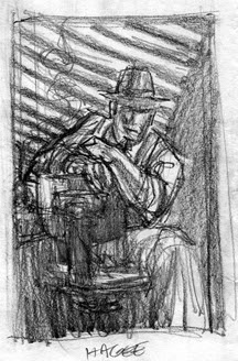
This is a thumbnail for the first Jack Hagee: PI cover for Moonstone Books a few years ago. I still have this thumbnail in my files but the original finished drawing that came after this thumbnail is in the collection of Hagee's creator and author, C. J. Henderson. I seemed to have misplaced a scan of the finished pencil drawing that came after. (But, I will continue to search).
I took some of my favorite elements of film noir and worked with the shapes, shadows and attitude. I sat in my studio, dimmed the lights and fell into Hagee's noir world. As I began sketching I swore I heard his chair squeak as it turned toward me and say, "So... how 'bout it?"

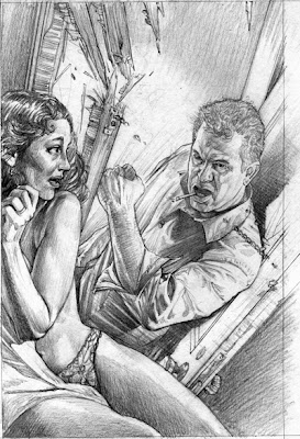
For a second Jack Hagee cover we went for a bit more action with a pulp inspired cover. But, he's not helping a damsel in distress here. Behind the locked door is the wife or the girlfriend, caught in a game of lies. And Jack hates this part of his job...

Thursday, July 31, 2008

To Be Continued...

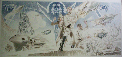
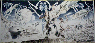
My obsession with comic strips, comic books, spaceships and science fiction started with watching the reruns of the Flash Gordon serials (starring Buster Crabbe) on television. I can still remember being captivated as I watched them early Saturday or Sunday mornings with my Father and brother. As a young artist, the serials made an incredible impression on me and my imagination took off.

I have a good friend who is a huge vintage sci-fi and rocketship collector. He has an amazing collection and awhile back we got on the topic of Flash Gordon collectibles. He remarked that, in his opinion, there wasn't an ultimate Flash Gordon painting out there that truly captured the verve of the beloved serial or Buster Crabbe. Everything was nostalgic and not contemporary. We talked about all the great moments of the serial, the visuals and how it would be a great personal project for me. He then talked me into doing this as a commission for him (as well as using it as a promotional piece).


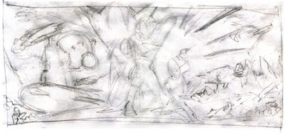
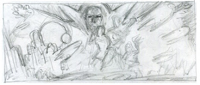
We started to discuss what it should look like and all the elements that it needed in the homage. I've saved you from viewing some of the awful scribbles that I did while we originally chatted about the scope of the piece. Instead I've selected some of the early thumbnails that came out of the discussions and then you'll see how I progressed and narrowed down the elements and design.


I thought that I had it with this one, so I started to focus on the details. Notes were written and I began looking for good reference.


Then I roughed this one out, one day while looking at the development. Something about it felt "right". Even though you probably can't tell by looking at this rough. The design and composition fell into place. So I started to focus on this one:


And from here I narrowed down my references and started to work on individual studies:


The Buster Crabbe study really didn't capture his likeness very well. But, from here I realized what my mistakes were when I began working on the painting.

Everything developed directly on the board. I don't usually start a painting without doing tight pencil drawings and studies to get my homework done. This way I feel like I worked out my problems ahead of time and then I can concentrate on just painting. This one was an exception. Simply, because I was running behind on my self imposed deadline and I wanted to finish it for the upcoming Pulp Show and start showing friends what I'd been working on for the last three - four months (in between assignments).


I started to draw directly on the board, putting all the elements in place and any problems that arose I simply solved them as they occurred.
Once that I completed the drawing (which took about 5 days), I blocked in my darks with Acrylics and started the painting.


The painting took a good week of 10 to 12 hour days. Fortunately, I found a break in my schedule and was able to paint it within that weeks time with some fine tuning of minor details here and there the following week.


Please view the finished painting at my website: www.douglasklauba.com