Wednesday, December 31, 2008

Sketchbook Entry 11: Happy Noir Year

This next drawing from my Sketchbook is from the cover of "Episodes From The Zero Hour" Volume 1 from Blinding Force Productions featuring Tommy "Knuckles" McNichols. This piece (and specifically the finished painting) is a very important project to me: one, because I'm mighty happy with the way all the noir, pulp and private eye influences all fit together for me, two: because the project moved along nicely with the writer, art director and designer and, three: because it forged a great professional and personal friendship with the designer Anthony Schiavino. Aside from Anthony having an impeccable eye for good design, he's a great writer / creator himself with some really fine ideas. Anthony and I talk a lot via email all week long, talking about everything important: comics, films, art, work and family (not in that order). We've become great friends this year and it all began with a Tough Guy, named "Knuckles" created by his cohort Jay Butkowski. It's a great pulp story (available at: www.lulu.com/zerohour) so give it a try.


When Anthony first inquired about my schedule and interest in the project, he had the cover designed with color palette options and a rough sketch. The original layout had "Knuckles" sitting behind the desk with his feet up, but after discussing the character with Jay and Anthony I came up with a rough thumbnail that had more body gesture and attitude of a tough guy for hire. More of a "Bobby the Mitch" swag to his personality. I also put more emphasis of noir by adding the blinds and played with light and shadows. Adding the framed boxing photograph behind him in the shadows introduced a bit more of the characters past.


Have a great 2009! Thanks for visiting the blog over the year. It's been quite a busy year for me, which explains the lack of posts but I'll get to them and I will try and update with new posts on a more regular basis in the coming year. I still have some exciting things to showcase as they take shape as well as continuing with the Sketchbook entries. See you next year.

Tuesday, November 18, 2008

The Phantom: Generations

New work:
Recently announced is a new Phantom series of comic novellas from Moonstone Books titled: The Phantom "Generations". I have been assigned to do the 20 covers of the series. And I felt this was the perfect opportunity for me as an artist to get back into the ink. This is very exciting for me to do a series of comic book covers for The Phantom where I will be able to stretch out a bit more and pull out the ink pen and brushes and collaborate with some really creative friends in producing the covers.

My good friend, Ruben Procopio has been a big inspiration over the years with his amazing sculptures from Electric Tiki and Disney to his black and white illustrations in "Tales from Zorro" and "The Phantom Chronicles". One of my all time favorite Phantom covers is his stark, noir-ish Phantom in the shadows for Moonstone's first Annual last year. Simply, brilliant. And we have been discussing some possibilities of working together ever since.

After Joe Gentile discussed the series of covers with me, I immediately thought of two things: working in black and white (to be digitally colored) and asking Ruben if he wanted to collaborate. Iron sharpens iron... and I'm working with the best.
There's one goal in mind with doing these together: to make them the best possible images of The Phantom.

I had already roughed out the first cover of "Generations" when I approached Ruben. But, we've already started developing the series of covers and we will be sharing the credit for the rest of the run. There's no formula yet; together we'll both brainstorm a batch to get approvals from Moonstone and for the time being, I'll pencil the finish and either I'll ink the entire piece (like this first one), partially ink for Ruben to take over and finish it or he'll ink the entire cover over my pencils.
We're going with the flow for the time being.


So, here's the first issue cover that I have titled, "The Oath". For those who have come in late... this is Christopher Standish Jr. making the legendary oath upon the skull of his fathers murderer: "I swear to devote my life to the destruction of piracy, greed, cruelty, and injustice, in all their forms! My sons and their sons shall follow me."


The inked art was then handed over to my friend and color artist, Jason Millet to finish. Jason was fantastic to collaborate with as well and he did an exceptional job.


The Phantom "Generations" begins early next year.
Check out Ruben Procopio's blog: http://www.maskedavengerstudios.blogspot.com/
And Jason Millet's site: www.jasonmillet.com

Monday, October 6, 2008

Killer Queen

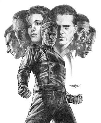
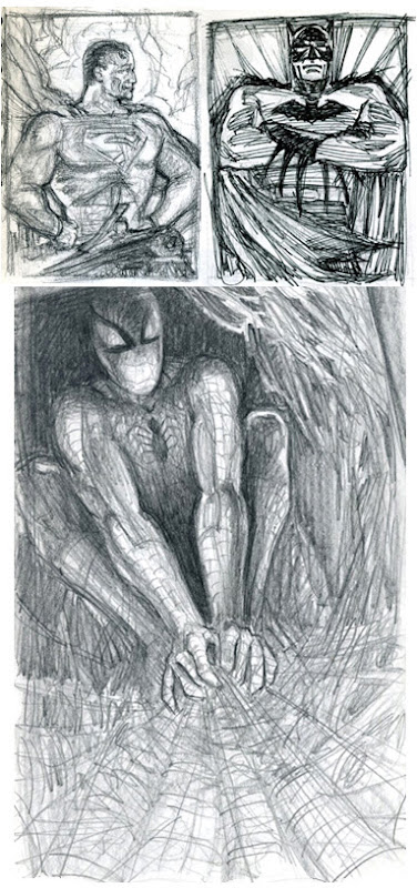
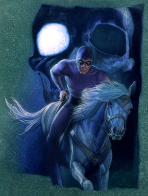
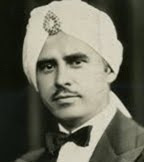
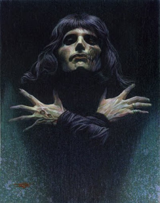
I was invited to participate in a group gallery show, Night of the Living Artist. The concept of the show sounded like a lot of fun, pick an artist (living or dead) that has influenced me and make them a Zombie. I first thought of Michaelangelo or Mucha but decided to look into other artists besides painters, that have made a nice influence on me. So, I picked Freddie Mercury from one of my favorite bands, Queen. As a teen, I'd sit in my room, listening to their music. For what seemed like hours I'd sketch ideas or interpret their songs into sword and sorcery images using Freddie as the main figure. But, instead of wielding a mike stand, it would be a sword. I could easily have portrayed him as people probably would remember him with short hair, mustache and sleeveless t-shirts. Here I've captured him the way I remember him, early on, royalty of glam-rock from a serious Mick Rock photo.


Friday, October 10, 2008 through October 31, 2008.
Opening reception Oct. 10, 7-10pm, closing reception will also be a Halloween party on Oct. 31, 7 -10pm. “Night of the Living Artist” will be including our resident DJ, DJ Tapedek.

The Chicago Art Department
1837 S. Halsted
Chicago, IL 60608

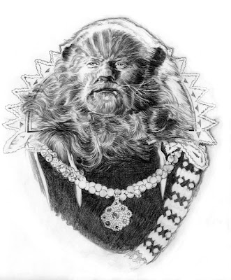
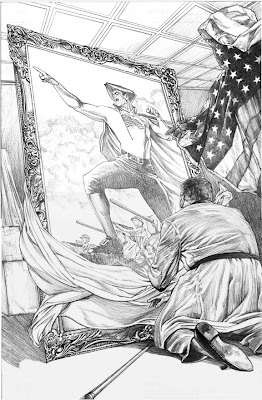
The artist will be using their prefered media and pick an artist, musician, or author (living or dead) that was an influence and Zobify them. Some of those picks include Preston Blair, Franz Kafka, Oasis, and even Jim Henson. The Chicago Art Department (CAD) cultivates new and emerging Chicago artists. Through education, exhibition, artist residencies, and community building, CAD is dedicated to supporting new voices and ideas. “My hope is this common theme will show how a range of different artist can come together in one show. And also give a chance to those new artists, who may have never been in an exhibit.” says Kerry Flaherty, curator of the show and resident artist of The Chicago Art Department. “Night of the Living Artist will have Fine Art, Illustrations, and even Plush Sculptors presented in a fun atmosphere.”

Gallery info:
CAD is in Pilsen
1837 S. Halsted St. between 18th and 19th Sts.
Bus: 8 Halsted. Fri-Sun noon-5pm.

For more information about the exhibit or for gallery
hours, contact The Chicago Art Department at
312.226.8601. Or go to plushinality.blogspot.com

Friday, October 3, 2008

The Avenger Chronicles

When I first started illustrating covers for Moonstone Books, Joe Gentile (Publisher and Editor in Chief) asked what covers would I want to do among the titles that they were doing. I asked about two characters: The Phantom and The Avenger.
It's been a long wait but I finally got my chance as Moonstone is about to release The Avenger Chronicles. The book will be released with two variant covers; one by Peter Caras and another by Dave Dorman. For the die hard Avenger fan, Moonstone Books is offering a special Limited Edition with some extra material and my cover featuring Justice Inc.


I had originally planned a straightforward cover featuring a grey Richard Henry Benson. And I tried a couple of different ideas, one concept specifically using an "A" similar to the posters for "A Clockwork Orange".


This concept later developed into a standing Avenger figure and the shadow sort of forming an "A" against a cold steel wall.
I gave it a shot but in the long run, it didn't work for me.


After seeing where I was at with the cover concept, Joe asked if it was possible to do the Justice, Inc. team as a cover for the limited edition. It was something that hasn't been illustrated before and he thought that it would be "special" enough for the Limited Edition.

So, I started fresh based upon our conversation and I came up with a more stylized costume for him, almost Nick Fury though.
But aside from this costuming not working (again) I had to figure out how to place the additional six figures with him, effectively and dramatically. Originally I avoided the floating heads idea because I didn't think it would work. So, I tried placing the figures behind him three on each side, but there wasn't enough room for that and keeping the central figure large enough without making it a wrap around cover.


Finally, the floating heads idea clicked with me and I figured out how to pull it together, keeping the updated pose with some adjustment to his look and jacket. I can't really say what made it click for me, possibly walking away from it or looking at some books. The top image is the finished cover art completed in pencil.
Look for the release of the book soon from Moonstone Books.

Wednesday, September 24, 2008

Sketchbook: Entry 10


A couple of years ago I had received a call asking for my credentials as a mystery/pulp/noir illustrator. The call came from a Chicago design firm, requesting to see my portfolio to present to their client. The project was a series of detective illustrations for an ad campaign for a commercial real estate group. At the time I had just been interviewed for The Mystery Channel about film noir, pulp art and the popularity of crime comics from DC and Moonstone. So, the mention of the interview along with my images, I was awarded the campaign of 5 illustrations.
It's good to have "street cred".
The designer was part of the concept process all the way through. We leafed through books on film noir posters and detective pulp and paperback covers. I then presented about 3 to 5 thumbnails per subject, possible type fonts and color palette choices.
Here's two out of the bunch along with the presentation drawing.

Thursday, September 4, 2008

Sketchbook: Entry 9 (Hey Toughguy!)


This is a thumbnail for the first Jack Hagee: PI cover for Moonstone Books a few years ago. I still have this thumbnail in my files but the original finished drawing that came after this thumbnail is in the collection of Hagee's creator and author, C. J. Henderson. I seemed to have misplaced a scan of the finished pencil drawing that came after. (But, I will continue to search).
I took some of my favorite elements of film noir and worked with the shapes, shadows and attitude. I sat in my studio, dimmed the lights and fell into Hagee's noir world. As I began sketching I swore I heard his chair squeak as it turned toward me and say, "So... how 'bout it?"

For a second Jack Hagee cover we went for a bit more action with a pulp inspired cover. But, he's not helping a damsel in distress here. Behind the locked door is the wife or the girlfriend, caught in a game of lies. And Jack hates this part of his job...

Thursday, July 31, 2008

To Be Continued...

My obsession with comic strips, comic books, spaceships and science fiction started with watching the reruns of the Flash Gordon serials (starring Buster Crabbe) on television. I can still remember being captivated as I watched them early Saturday or Sunday mornings with my Father and brother. As a young artist, the serials made an incredible impression on me and my imagination took off.

I have a good friend who is a huge vintage sci-fi and rocketship collector. He has an amazing collection and awhile back we got on the topic of Flash Gordon collectibles. He remarked that, in his opinion, there wasn't an ultimate Flash Gordon painting out there that truly captured the verve of the beloved serial or Buster Crabbe. Everything was nostalgic and not contemporary. We talked about all the great moments of the serial, the visuals and how it would be a great personal project for me. He then talked me into doing this as a commission for him (as well as using it as a promotional piece).


We started to discuss what it should look like and all the elements that it needed in the homage. I've saved you from viewing some of the awful scribbles that I did while we originally chatted about the scope of the piece. Instead I've selected some of the early thumbnails that came out of the discussions and then you'll see how I progressed and narrowed down the elements and design.


I thought that I had it with this one, so I started to focus on the details. Notes were written and I began looking for good reference.


Then I roughed this one out, one day while looking at the development. Something about it felt "right". Even though you probably can't tell by looking at this rough. The design and composition fell into place. So I started to focus on this one:


And from here I narrowed down my references and started to work on individual studies:


The Buster Crabbe study really didn't capture his likeness very well. But, from here I realized what my mistakes were when I began working on the painting.

Everything developed directly on the board. I don't usually start a painting without doing tight pencil drawings and studies to get my homework done. This way I feel like I worked out my problems ahead of time and then I can concentrate on just painting. This one was an exception. Simply, because I was running behind on my self imposed deadline and I wanted to finish it for the upcoming Pulp Show and start showing friends what I'd been working on for the last three - four months (in between assignments).


I started to draw directly on the board, putting all the elements in place and any problems that arose I simply solved them as they occurred.
Once that I completed the drawing (which took about 5 days), I blocked in my darks with Acrylics and started the painting.


The painting took a good week of 10 to 12 hour days. Fortunately, I found a break in my schedule and was able to paint it within that weeks time with some fine tuning of minor details here and there the following week.


Please view the finished painting at my website: www.douglasklauba.com

Sunday, June 22, 2008

Wizard World Chicago


You can see me sitting with the crew from Dynamite Entertainment at their panel on Saturday:

11 a.m.-12 p.m.
DYNAMITE ENTERTAINMENT
The Dave Stevens Room: 10-11
Join Dynamite Entertainment and special guests from both comics and other media for an exciting hour of news, discussion, free comics and special BIG announcements. It's a DON'T MISS event!

Hopefully, I'll be able to get a word or two in on the panel conversation!
See you there!

Sunday, May 18, 2008

Sketchbook: Entry 8


Doc Savage

Another Moonstone Books exciting pulp release is soon to be available this summer: Doc Savage, The Lost Radio Scripts of Lester Dent. Among the choice of covers, you'll find mine along with an alternate by Bob Larkin.
From the start, when Joe Gentile started to discuss this cover with me, the pressure was on. Not from Moonstone (well a little) but my own pressure. I had grown up reading Doc Savage The Man of Bronze. First from Marvel Comics, then the Bantam paperbacks, then the George Pal movie (at least the one sheet looked cool!) and later on the pulp reprints and the fan club from Supergraphics. I had even co-published an amateurish fanzine called "The Doc Savage Fan Magazine" with a friend of mine on his mothers mimeograph machine way back in the mid-1970's.
So, the cover was important that it be identified to it's pulp roots as well as something contemporary for the modern book buyer. After focusing on my concept of the classic Pulp Hero, Clark "Doc" Savage as a supreme adventurer and adrenaline junkie, the process began: thumbnails and the typical scribbles to find effective shapes for the design and composition. I then called upon one of my favorite covers from 1935 as inspiration with Monk driving Doc on their vehicles side board at break neck speed. Before finishing the final painting, I added a bullet hole in the windshield to add to the "story" of the piece.

Sketchbook: Entry 7


General Jack Cosmo

I met the creators of General Jack Cosmo a few years ago in Artist's Alley at Wizard World Chicago and they introduced me to their Sci-Fi universe by handing me one of their GJC Preview comic books. Aaron Shaps is a helluva writer and creator and I was very intrigued with what he had handed me to check out. We became quick friends (along with the rest of the creative crew Mike Beazley and Jim McKern) and... to make a long story short: I was commissioned to do a cover for one of their many ambitious projects, General Jack Cosmo and the Vampire Men of Kothos! Aaron describes him best as a cross between Flash Gordon and Hunter S. Thompson. I wanted to do an iconic image that would serve them best and represented an energetic-in your face- pitchfork ready- action pose for the cover and any other merchandise they had planned. I did pages of thumbnails but this one image returned time after time. Do yourself a favor and pick up #1 and #2 at your comic shop, an upcoming comic con or online.
Find out more at: www.cosmo-verse.com

Wednesday, April 23, 2008

Sketchbook: Entry 6, Pulp!


The Spider Strikes!
From the Pulp file and right out of my Sketchbook, I have a couple of sketches that I worked on with Joe Gentile at Moonstone Books for approval of our design of the classic pulp hero. Moonstone laid out there plans and ideas to introduce The Spider into their new paperback prose line. Joe gave me the specifics that the licensor was asking for: The Spider ring, suit, cape, gloves, hat, wild hair, fangs (no hunchback) and they wanted me to design an original mask. Moonstone presented our original design and drawing to Argosy which was well received. After a couple of adjustments, Moonstone was given the green light to move forward on the project.

Coming up this week end, April 25 - 27 is the Windy City Pulp and Paperback Convention at the Westin Lombard Yorktown Center. 70 Yorktown Shopping Center in Lombard, Illinois. More info: www.windycitypulpandpaper.com

This is my favorite show and the one I anticipate every year. Amazing Original Art on display and for sale, 1000's of Pulps, Paperbacks and Movie Memorabilia, Old Time Radio and Pop Culture. Come on out and celebrate 75 years of the Hero Pulp Explosion!

Monday, April 7, 2008

New York Comic-Con: Artists Alley H28

The Comic convention that is sure to be the biggest event all year is fast approaching. The New York Comic-Con is April 18-20 at the Javits Center. I will be in Artists Alley at Table #H28 where you can find my Sketchbook, a small selection of Limited Edition Prints as well as original art and drawings from various projects ranging from The Phantom to Project: Superpowers.
Please stop by to say "hello" on Friday or Saturday! Because of my schedule I will not be there on Sunday.

Sketchbook: Entry 5


Beware: the Ides of March


Indian Motorcycles

After I completed the Bosch Company 100th Anniversary Poster, I was commissioned by a local Indian Motorcycle dealership to present concepts for an advertising poster. This was one of those concepts that developed right away from thought to paper with very little time for preliminaries. One of my favorite subjects is Symbolist art and here I used a Native American Indian to hold back the storm as the Indian motorcycle riders ride through. The project was put on hold and then there was the very unfortunate demise of the Indian Motorcycle Company...

Tuesday, March 18, 2008

Sketchbook: Entry 4


The Bat-Man.

At the time I was planning this painting and working on sketches I came to the realization that after all the years of working as an illustrator as well as a comic book fan I had never painted any of my favorite heroes. Heroes that had inspired me and made a big impact on my formative years as a young artist. So I drew upon many of my influences at the time, particularly 1930's Art Deco, Sculptors like Paul Manship and golden-age comics. I concentrated on an effective shape of Bat-man's cape, an iconic pose and dramatic lighting on the figure as well as creating a mysterious "atmosphere" in the Gotham City skies.

Wednesday, March 5, 2008

Sketchbook: Entry 3


CITY by Clifford D. Simak is an all time classic of science fiction writing.


This drawing was presented for the cover of the Centennial Edition published by Old Earth Books and the project moved along very well from start to finish. I started out re-reading CITY and soon realized I hadn't read it since my teens and so, it definitely felt like I was reading it for the first time. I started taking notes, I doodled images as I read and the cover quickly developed in my mind.


The image is inspired by one of my favorite golden age illustrators, Franklin Booth with the large shape of trees and smaller figures as a focal point. I worked with a straightforward design and composition and I feel it is very fitting for the subject matter. Also, I'm sure I was tempted to do the cover in pen and ink! In fact I had two different color palettes in mind; one very cool palette (and very contemporary) and one in a warm palette (and retro). After discussing the options with designer, Robert Garcia we decided the warm palette was suitable for the new edition and that was what I painted. I know I will soon do the pen and ink version and I have a strong feeling I will eventually do the same painting in the cooler color palette. Because I keep working that over and over in my mind and on paper. Just for my enjoyment and the celebration of a great subject.

Thursday, February 14, 2008

Wonder-Con

I will be at Wonder-Con next week, February 22-24 at the Moscone Center South in San Francisco. If you're coming to the show, visit my table in Artists' Alley: AA132.

Sneak Peek: The Phantom #25 Cover


For those who came in late...
Some have become familiar with my work because of my painted Phantom covers for the Moonstone Books series that started with the (now sold out) trade paperback collection back in 2003. Moonstone publisher and editor-in-chief, Joe Gentile has described my relationship with Moonstone and The Phantom best:
Joe explains, "With The Phantom, we were really looking to do something that would be noticed. We are basically dealing with a man in purple tights running through the African jungle. So, we wanted to showcase what makes the Phantom who he is: the 'Ghost Who Walks'. He has been looked upon with awe and respect for 20 generations. We needed to amp up the character's innate mystery and power, and somehow make him look like a real human being, but show that he may be MORE than that. That's where Doug Klauba comes in. With Doug's painting of the Phantom, by far the most powerful and most emotion - provoking depiction of this character that I have ever seen, he shows the Phantom realistically, but with that extra touch of otherworldliness that befits the 'Ghost Who Walks'. The Phantom is a guy who, when he walks into a room, the bad guys immediately want to leave. Here, with Doug's painting, I think he captures the inner intensity of the character like never before."

The current Phantom team headed by Mike Bullock is currently approaching issue #25 with an exciting, all out-action packed double issue. Mike invited me to illustrate his story arc across a wrap around cover and I wholeheartedly accepted the challenge. What you see here is a study of the cover image without the back cover elements. The back cover will be a montage of story elements and characters from issues #19-#25. Normally, my studies for The Phantom stop at pencil drawings with some added acrylic color over scanned print outs- but with this one, I couldn't resist! I did a finished painted study as I continue to fine tune the rest of the drawing for the complete wrap around cover. You'll find this image as Moonstone solicits issue #25, but you'll see the full wrap around art when that issue hits the stands. Order yours now!

Wednesday, February 6, 2008

Sketchbook: Entry 2


This art deco inspired cityscape was originally imagined for my calendar illustration of Buck Rogers for The Adler Planetarium and Space Museum in Chicago. I used art deco elements and incorporated them into buildings from old 1930’s – 1940’s photographs and the film, Just Imagine. After working on the study I soon realized that it wasn’t going to work in the futuristic video monitor. The shape wasn’t fitting into the video screen as I had intended (partly because I decided to change the monitor’s shape into a much more “retro-futuristic” design). But, the buildings just weren’t foreboding enough either. So, I filed it away and resurrected it later on into a personal and experimental painting of Batman and named it Gotham City.


The illustration of Buck Rogers was imagined for the Adler’s 2001 calendar. When the project was presented to me, my subject for the given month was “Haley’s Comet”. I soon developed a sketch that represented my thoughts of the museum that I remembered from visiting many times as a young boy. The memories of my visits always filled my super charged imagination with epic space travel, planetary tales, stars and sci-fi heroes. This is what I wanted to illustrate and now I had my concept in mind. I placed my space hero from yesteryear in front of a video monitor (from the film Things To Come), alarmed by the foreboding meteor and ready for adventure with his dome helmet and raygun in his holster. I incorporated my admiration of pulp art and vintage sci-fi into the Haley’s Comet theme. And even more suiting was the tie-in with the Buck Rogers character frozen and awaken some 500 years later into the future world of New Chicago. I thought it was a very well rounded piece for a Chicago institution. The finished illustration was later accepted into the pages of Spectrum 8: The Best In Contemporary Fantastic Art and then re-used as a promotional poster and advertising for CF3: The Chicago Fantastic Film Festival.

Thursday, January 24, 2008

Sketchbook: Entry 1


The Shape Of Things To Come title is a description of where I think my artwork is at as I continuously develop a new body of work as an artist and illustrator. Of course it also hints at the conceptual stages from thoughts, pencil roughs and studies to finished paintings. Here, I hope to share the adventure of how the works take “shape” and what “comes” out of the process.
And if you have a copy of my Sketchbook, I’m going to discuss the drawings in the book page by page. It shows glimpses of where I have been as an illustrator and hopefully where I think the work is headed. And I welcome your interaction.

The Sketchbook is a collection of my drawings and roughs that have been appreciated by clients and friends. Many suggested that I begin to show them as a separate portfolio or a devoted section on my website. So my friends at Olympian Publishing shared my vision and helped me select a “behind the scenes” showcase of seldom seen drawings and we got it to press.

The book opens with a “Foreward” by my friend Jim Steranko, much to his surprise I’m sure. Because it is actually a postcard he sent me in response to a fan letter I sent him when I was 13 years old, and it is very important to me. I vaguely remember the drawings I sent him but more importantly he inspired a young artist by responding to me! I was an avid comic book reader and collector (as well as clipping illustrations out of magazines and collecting paperback covers) and among the artists that I followed and copied was Steranko. I admired him (and still do) for the craftsmanship in his comic book illustrations and then his switch to paperback covers and then back to comic book covers and then to his own publishing company. At the time it guided me away from concentrating on just being a comic book artist to the possibility of being an illustrator as I began to seriously consider a future career as an artist.

And on my “Introduction” page there is my drawing of a planned portrait of “La Bete” from Cocteau’s Beauty and the Beast, one of my many favorite films. Originally a study for a Beauty and the Beast painting from a few years ago, it has been sitting in my studio as I work out color roughs in between projects and deadlines. And he waits in all his majestic glory and grandeur.

Saturday, January 12, 2008

Project: Superpowers


SUPERPOWERS #0 from Dynamite Entertainment
by Alex Ross, Jim Krueger, Stephen Sadowski & Doug Klauba

From the dawn of the 20th Century came a new chapter in mankind's history, unleashed during a time of great war and destruction. It was the beginning of the Age of the Superpowers, yet with the closing of the Second World War, this new spark seemingly flickered and died. Until now! This explosive 0 issue features a story crafted by Justice collaborators Alex Ross and Jim Krueger, joined by artists Stephen Sadowksi and Doug Klauba, and featuring a final page painted by Ross himself! The story of Superpowers begins here, in the present day with the Fighting Yank, coming to terms with the ghosts of his past and present! Journey to the heights and depths of the Second World War as the story unfolds and come face-to-face with the great forgotten heroes of the ages, and solve the mystery of these legends disappearance after the great war!

32pgs, FC..........$1.00

That is how Dynamite describes the new series to arrive in stores early 2008. Originally titled, Superpowers it seems it is now titled, Project: Superpowers.
And I've seen some color proofs and this first issue looks very cool. I'm excited (really excited) to have worked on the inaugural issue. And truly just plain excited that I was hired to do more sequential work - which is what I love to do. Tell stories with my art.

Alex asked if I'd be interested in doing more sequential stuff and then Superpowers came about. I had seen the Newsarama article announcing the series and knew that this was a series that I'd be interested in buying. I've always been interested in the golden age characters and pulp heroes, so I knew that this was for me especially with the team of Alex and Jim Krueger on it. I was very surprised to be offered part of the story. I don't think I hesitated when Alex asked if I'd be interested in doing the "present day" pages of the story, seven and one half pages of art. Obviously, from the description above, my pages are the "present day with the Fighting Yank, coming to terms with the ghosts of his past and present" while the talented Stephen Sadowski handled the larger part of the story. More of my pages can be seen at my Project: Superpowers Gallery at www.comicspace.com/dklauba

Dynamite was great to work with and their heart is in deep with Superpowers. It's been in developement for some time and I'm thrilled to have been a part of it. More info on Project: Superpowers can be found at the Dynamite site:
www. DynamiteEntertainment.com

Sketchbook release


DKSketchbookCvr
Originally uploaded by dcklauba
Available now!

The Douglas Klauba Sketchbook is a soft cover, perfect bound 8.5 x 11 artbook with full color covers and 70 black and white pages of drawings, sketches and roughs showcasing the last 6 years of my projects for Sci-Fi, Pulp, Fantasy, Costumed Heroes and Cover Art for various publishers and clients.
Also a selection of Sequential Art pages from pencil to inks of my short story, "Raja Yah" originally published in Moonstone Monsters: Ghosts.
And for the first time ever a special section of never-before-seen preliminary art for The Phantom covers for Moonstone Books with commentary by historian Ed Rhodes and personal quotes from Ruben Procopio, Alex Ross and Thomas Blackshear.
Price $20.00

The book is available directly from me, from Moonstone Books, Dreamhaven Books and the Bud Plant website:
http://budplant.com/product.asp?pn=DOUGS&bhcd2=1197994276
Or in Canada from the fine folks at Girasol Collectables: www.girasolcollectables.com/


A limited edition, signed and numbered with pencil sketch on the title page is available for only: $45.00
Please email me for info.